Web Blooper of the Month
Confusing Checkboxes and Radiobuttons
Checkboxes and radiobuttons were devised as logically different controls, intended for different situations:
- Radiobuttons are for choosing one of several options.
- Checkboxes are for ON/OFF choices.
Unfortunately, many GUI and Web development toolkits blur the distinction between them: they treat them as the same component, with an attribute to specify one vs. the other. As a result, radiobuttons and checkboxes are sometimes mixed up.
CharityFocus.org
The most common result of such confusion is a single radiobutton, all by itself, as if it were a checkbox. An example of this can be seen below in a volunteer registration form at the website of CharityFocus.org (see below). Besides being the wrong control for a YES/NO choice, there is no way to turn a single radiobutton off once it is on.
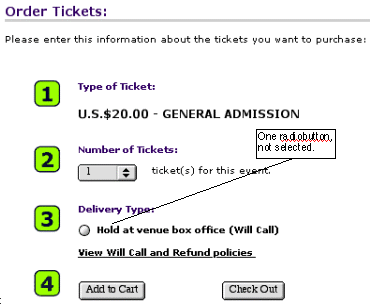
TicketWeb.com
Besides developer oversights, a common cause of this blooper is that the website offers a variable number of choices depending on circumstances, but doesn't properly handle the case when only one choice is available.
This is why the online ticket-purchasing service TicketWeb.com has the blooper (see below). Normally they offer ticket buyers a choice of how the tickets should be delivered, and present the choices using a set of radiobuttons. However, if you buy tickets too late for anything but Will Call (pickup from box office at event), the site gives you one radiobutton. Worse, it's off by default; you have to turn it on before the site will let you proceed.
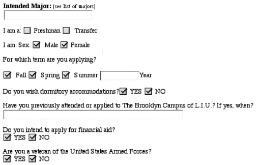
Long Island University (LIU.edu)
The opposite error -- using checkboxes where radiobuttons are correct -- is almost as common.
One site where it occurred is Long Island University's website, LIU.edu. LIU.edu's online application form misused checkboxes for what should be mutually-exclusive radiobutton choices, allowing applicants to check both male and female, apply for multiple school terms simultaneously, and answer both "Yes" and "No" to questions (see below).
Avoiding the Blooper
To avoid committing this blooper, developers just need to be aware of the rules for using radiobuttons vs. checkboxes. Again:
- Radiobuttons are for choosing one of several options.
- Checkboxes are for ON/OFF choices.
If your toolkit of Web controls treats checkboxes and radiobuttons as the same type of component, make sure you set the attribute to get the right type of control. Better toolkits treat the two types of components as distinct, minimizing the chance of confusion.
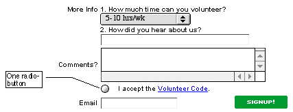
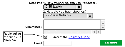
CharityFocus.org
As an example of correct usage of a checkbox for a single Yes/No choice, below is the corrected form at CharityFocus.org (see below). The lone radiobutton has been replaced by a checkbox. The checkbox is on by default. Obviously, they want visitors to accept the Volunteer Code.
When the number of choices is variable, design your form so that it adjusts the presentation from radiobuttons to something else when only one choice is available. What the "something else" should be depends on whether the one choice is optional or mandatory.
One Choice, Optional
When there is only one choice and users can choose it or not, do exactly what you would do if the number of choices were always one: use a checkbox, not a radiobutton. Whether the checkbox is checked or not by default depends on what you expect the most common response to be.
One Choice, Mandatory
When your website normally offers a one-from-many choice but only one option is currently available, and it is mandatory, what do you do? It is tempting to display a checked checkbox, and either: a) make it non-editable or b) have the form flag an error if the user turns the checkbox OFF and tries to proceed.
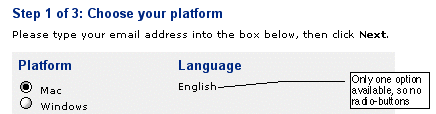
Sibelius.com
However, there is a better solution when the system offers only one option: don't present a control at all; just show what will happen. This is how the one-checkbox blooper is avoided at sibelius.com, the website of a music software company (see below). On the product download page, it would show a choice of languages if there were a choice, but for this product only an English version is available, so it just says that. Simple and clear.