Web Blooper of the Month
"Click Here": Burying Links in Text
Many professionally-developed websites look like they were developed by amateurs. One thing that really conveys that impression is links embedded in prose text. The oft-seen "click here" is the most familiar example.
It is common to see such links in personal and family websites. For example:
Our family trip this year was to Yosemite National Park in California. For photos, click here. For photos of our previous vacations, click here.
When I see "click here" links in a professionally-designed website, I consider it a blooper. Such links are too informal and amateurish for a professionally-developed website.
Yale University (Yale.edu)
Look at an example from Yale University's alumni sub-site. There, in a small font, are some very wordy instructions with a "click here" link (see below). Try to figure out quickly where the link goes. This blooper is in spite of Yale's excellent Web style guide (Lynch and Horton, Web Style Guide, 2002), which says that the link should be on the heading.

Stanford University (Stanford.edu)
Not to be out-bloopered by its east-coast rival, Stanford University's website uses verbose bullet-items with "click here" links (see below).
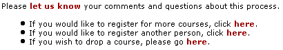
It would be much more effective to list -- and link -- only crucial phrases:
- Register for more courses
- Register another person
- Drop a course.
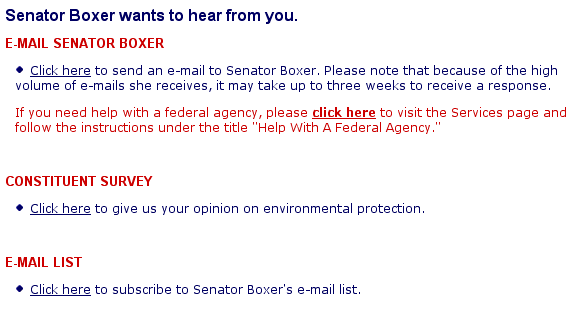
Senator Barbara Boxer (Boxer.Senate.gov)
Finally, the "click here" blooper can be found at websites of several U.S. Senators. Barbara Boxer's Senate website is an example (see below).
Avoiding the Blooper
"Click here for details" is poor Web design. Instead, the link should consist of just the most important word or phrase, e.g., "Details". More generally, links should not be buried in prose paragraphs. There is one exception, discussed later, after some examples of avoiding the blooper.
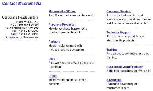
Macromedia.com
Macromedia shows on the Contact Macromedia page of its website how links should be done. The page could have stated "For directions to Macromedia Headquarters, click here." For the different categories of contact information, they could have put the link on some words in the brief description. Wisely, they didn't. The headers are the links. The links stand out, so the page is easy to scan.