Web Blooper of the Month
Intolerant Text and Number Fields
If your website contains text or number type-in fields, your web software must of course check what people type to make sure it is valid. But to be friendly and helpful, you have to tolerate reasonable variations in what people type. If you are too particular, or make people type data in unfamiliar formats, people won't like your site much. You'll have less traffic than you'd like and, if your site is commercial, your sales will suffer.
United.com
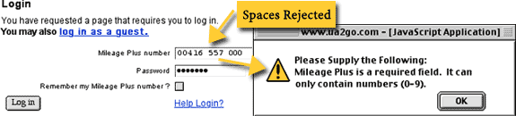
United.com, the website of United Airlines, is notoriously intolerant in what it accepts in type-in fields. It often commits the sin of not accepting data in familiar formats. In the illustration below, we see that Frequent Flier numbers are rejected if entered in the format that United itself uses on Frequent Flier cards and printed mileage statements. Another form at this site rejects credit card numbers that include spaces. Memo to United's Web developers: those spaces are in those numbers for a reason. They make it easier to scan and check the numbers. Let us type them!
sony.com
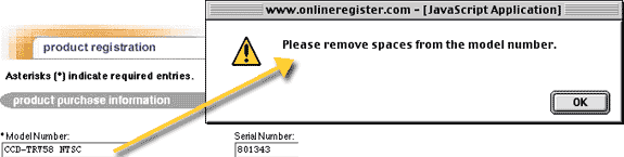
I recently found an amazing example of form intolerance at Sony.com, the website of the well-known electronics company. Assume you've bought a Sony product and want to register it. You go to the Product Registration page (see illustration below) and type the product number exactly as it is shown on the packaging and in the owners' manual: "CCD-TRV58 NTSC". You fill out the rest of the form, click Submit. Up pops an error message "Please remove spaces from the model number."
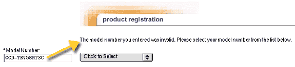
At this point, you might wonder: "Why can't they remove the @%# spaces and go on?" Why, indeed? But they don't do that, so you sigh, remove the one space from the Model Number (see illustration below), and click Submit again. Another error message appears: "The model number you entered was invalid." [Note: This error message appears on the page itself instead of in a pop-up error dialog box. Why are the two error messages are displayed differently? And why is the message in the past tense, as if the number entered was invalid, but no longer is?] The message doesn't explain what is wrong with the model number now, but a menu is provided, allowing you to choose a model number. You might wonder why this menu wasn't provided to start with.
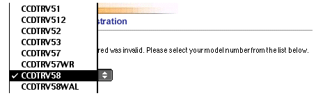
You click open the menu, and there is your model number (see illustration below), free not only of spaces, but also of hyphens, which neither error message mentioned. You select it and emit a sigh of relief as the form is finally accepted. But your impression of Sony has dropped several notches.
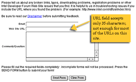
Intel.com
As comic relief from so many annoyingly intolerant forms, let's look at one that's so bad it's funny. Intel.com is the website of Intel Corporation, maker of computer microchips. Part of Intel.com is devoted to the Intel Developer Forum. The Intel Developer Forum sub-site has a Feedback page for sending feedback to the webmaster. They ask for the URL of the page about which you are providing feedback (see illustration below). But the URL field accepts a maximum of 35 characters, which isn't enough for the URLs for most of the pages at the site. It won't even fit the sample URL at the top of the page!
Why All This Intolerance?
Why are all these websites so intolerant and uncooperative? Why are they so picky about what people type? Why can't they even accept data in a common formats -- even just one common format -- or in formats that the companies themselves use elsewhere?
One common excuse is that it is hard for programmers to write software that can interpret and accept a data typed in anything but a single very simple data format. Perhaps, but consider how many user-hours are wasted for each programmer-hour saved. More to the point, consider the traffic and revenue lost due to intolerant, annoying forms. Consider the impression you give your customers when your website rejects model numbers typed exactly as they are appear in your own packaging and literature. They get the impression that your company is lacking in organization and coordination: one side doesn't know (or care) what the other side is doing.
Avoiding the Blooper
The best way to avoid this blooper is to let visitors to your site choose what they want rather than typing it. That means using menus, lists, radiobuttons, and custom data-specific controls. However, there are cases when it isn't feasible to do that. Fortunately, the guidelines for providing user-friendly, tolerant type-in fields are simple:
- Match field length to data. The visible length of a field should suggest the length of the data to be typed.
- Refuse invalid characters instantly. Where possible, type-in fields should be constructed so as to reject illegal characters immediately as they are typed, with a sound (e.g., beep) to alert the typist of the rejection. For example, a number field should simply beep if someone tries to type letters into it. This approach is much, much better than accepting invalid characters, then displaying an error message after-the-fact. It also reduces the need for client-side data-checking code for the input fields.
- Accept common formats. If the data has a common, accepted format, allow it. If there are several, common formats, allow as many as is feasible. For example, a time-field could accept times in any of the following formats: 12:30 am, 12:30 A.M., 12:30 a, 00:30, 00:30 h.
- Accept your own formats. Accept data in the formats you use elsewhere. For example, if your printed product codes look like "ZX-4563.33 QR", your Web forms should accept the codes in that exact same format..
- Make letter-case irrelevant. If you expect users to type codes that include letters, and if letter-case is not significant for the data (e.g., the data is always in one case), users should be able to type either upper or lower case into the field. Continuing the above example, they could type either "zx-45..." or "ZX-45...".
- Provide a pattern. If there is no common format, give an example of a valid format, e.g., "DD/MM/YYYY", or "Sample Serial #: QP-00275-5559". Put it somewhere right next to the field: above it, below it, or on either side.
- Structure fields. Where possible (e.g., where the need to allow different international formats doesn't prevent it), build the format you want into the form by structuring the data-fields. If you know, for example, that only U.S. phone numbers will be entered into the form, you can structure it into separate fields for area code and number.
- Facilitate moving between fields. If you segment a datafield into sub-fields, you must make it easy for users to move the input focus (also known as the text insertion point) between fields. For example, a form can automatically move the input focus to the next field when the required number of characters has been typed. The TAB key should move the input focus from one field to the next logical field; otherwise you're not only violating users' expectations, you're making your site inaccessible to visually-impaired people.