Web Blooper of the Month
Search "Hits" All Look Alike
Imagine for a moment that you've just used a website's Search function to find something. You typed Search terms into a text box and are now looking at a list of matching items, often referred to as "hits". Think about how you evaluate the list of hits. Do you carefully read each item, scrutinizing every detail? Do you click on each item one-by-one? Of course not! You quickly scan the list, looking for "hits" that look promising.
Now imagine you are a Web designer, but an evil one. You want to make it as difficult as possible for people to scan Search results looking for promising items. How could you do that? Behold three important techniques of the evil designer! Bwa, ha, ha, ha!
- Bury information in noise. One excellent way to make the list of found items difficult to scan is for each item to include lots of poorly-formatted but useless prose text. It needn't even be the same "noise text" from one item to the next, as long as there is a lot of it. Har, har, har!
- Bury differences in sea of sameness. If you want to make it even harder for users, make all the found items look similar, so people have to carefully examine each one to see what it's about and how it differs from other items. For example, you could load each listed item with marketing hype or database output that is the same for every item. That'll slow them down! Nya, ha, ha!
- Force 'em to click on items. The absolute best way to prevent people from scanning Search results is to make the found items look exactly alike. Then the only way to check an item's relevance is to actually follow the link to wherever it goes, consuming the user's valuable time while the browser fetches the page. Bwaaahhhh, ha, ha, ha!
Seriously, many Web Search facilities -- especially those for searching within websites -- use these "techniques" so well that one might think that the Search facilities were designed by evil designers trying to make life difficult for visitors.
ChicagoFed.com
Let's examine results from a search at the website of the Federal Reserve Bank of Chicago (www.ChicagoFed.org). I was looking for a mortgage calculator I had found on that site previously. I typed "calculator" into the site's Search box and got the results shown below. Note that item includes a bunch of HTML noise -- what is that for? Its main impact is to make "hits" bulkier, so they take longer to examine. I didn't succeed in finding the calculator by searching. I had to go back to the Home page and resort to browsing.
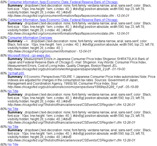
ChicacoFed's Search function uses technique 1 from our evil designer's toolbox to frustrate users: burying information in noise.
DigiGuide.com
To see examples of technique 2 -- burying differences in a sea of sameness -- look at search results from DigiGuide.com, an online television guide (below).
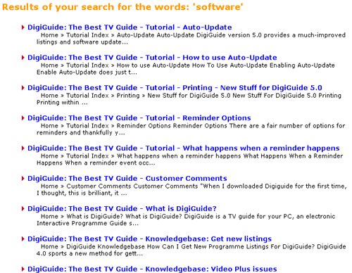
DigiGuide's Search results increase the similarity of found items by starting every friggin' item with "DigiGuide: The Best TV Guide". Not only is marketing hype inappropriate here -- we're already at their site -- repeating it for every item is beyond useless, beyond annoying, it actually reduces usability by increasing the sameness of items. An evil designer must lurk at DigiGuide.
SiliconValley.com
What about the most diabolical evil technique: making all the found items look so alike that the only way to check their relevance is to click on them? In late 2001, the technology news site SiliconValley.com provided an example of that. The figure below shows the result of searching for articles about "usability".
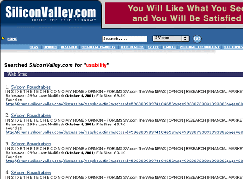
Like ChicagoFed, each item includes a lot of gobbledygook of no value to human users - visual noise. But these search results are worse than ChicagoFed, because the noise is the same for all items. The only visible difference between the found items is their file size - not very useful for deciding which articles are relevant. Truly diabolical. As I stared at the results of my search, I could almost hear the designer's evil laugh: bwaaahh, ha, ha, ha.
SiliconValley.com must have realized that this diabolically evil Search facility was hurting their bottom line. In early 2002 they replaced it with one that displays more reasonable results.
Avoiding the Blooper
How do we avoid letting the evil designer within all of us compromise our otherwise good intentions? Easy: just invert all of the evil designer's rules.
- Show and stress important data. The data shown for each found item should be that which defines the item and makes it different from other possible found items. At the very least, the defining, distinguishing data for each item should be presented most strongly. Additional information, if it must be shown, should be de-emphasized. In information-theoretical terms, cut the visual noise and focus users' attention on the information in each item.
- Minimize repetition between listed items. Most of each listing should be information that lets people distinguish items from each other.
- Minimize the need to click. Ideally, people should have to follow links for found items only to actually get the item (purchase, read). They should not have to follow links just to decide which item(s) they want.