Web Blooper of the Month
Important Info Below Fold
This may be the original Web blooper -- a design error that has been common since the first websites were put up. It has been discussed and written about for so long by so many Web design experts in so many books and articles that I decided not to mention it in Web Bloopers. I figured Web designers were well aware of this blooper and the need to avoid it.
I guess I was wrong.
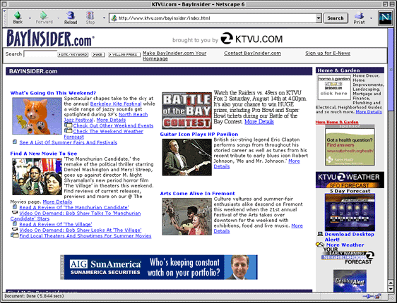
BayInsider.com
For example, on the Home page of BayInsider.com, a SF Bay Area information site run by local television station KTVU, the most important content on the page -- a list links to Bay Area resources -- is below the fold (see below).
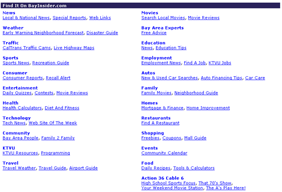
To see the resource list, visitors must scroll down the page (see below).
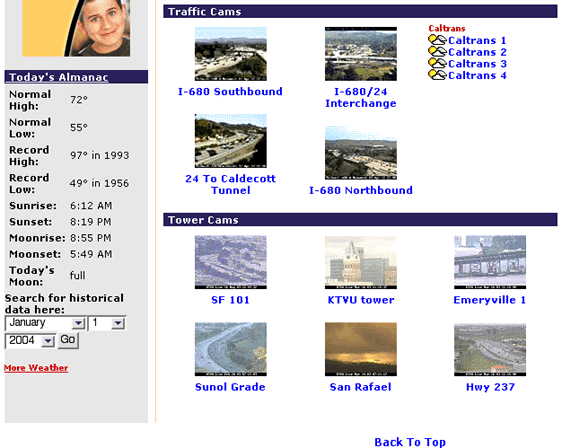
Compounding the blooper, if a visitor chooses "CalTrans Traffic Cams" from the resource list to see live camera-images of traffic on local highways, BayInsider displays a page on which the camera-images -- what the user wanted -- are below the fold.
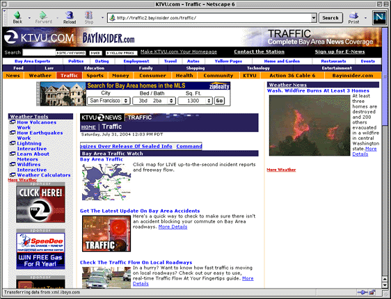
To see the camera-images, visitors must scroll down the page again (see below).
Weather.com
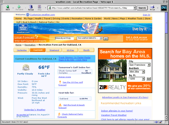
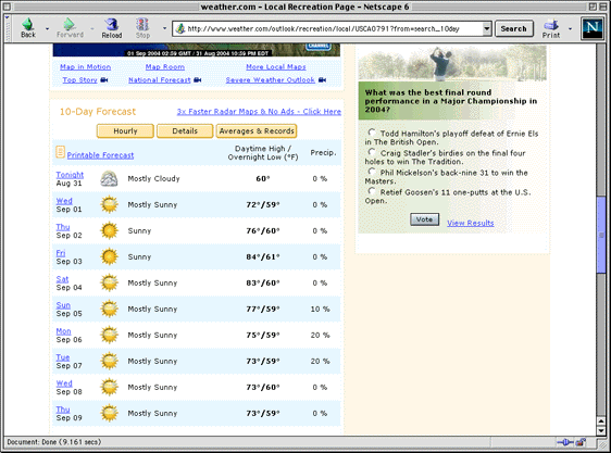
The blooper can also be seen at Weather.com. Request a 10-day forecast for a city -- in our example, Oakland, CA -- and the site goes to a page on which the current weather is in view, but the 10-day forecast -- what the visitor specifically asked for -- is below the fold.
To see the 10-day forecast, visitors must scroll down the page (see below).
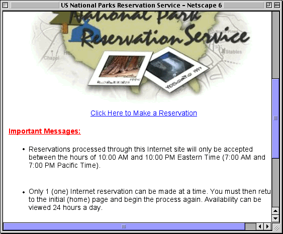
U.S. National Park Service Website
The U.S. National Park Service's website for reserving campsites has a particularly severe form of the blooper. Clicking on a link to reserve a campsite displays a small pop-up window in which the link for the main function of the window -- reserving a campsite -- is below the fold (see below).
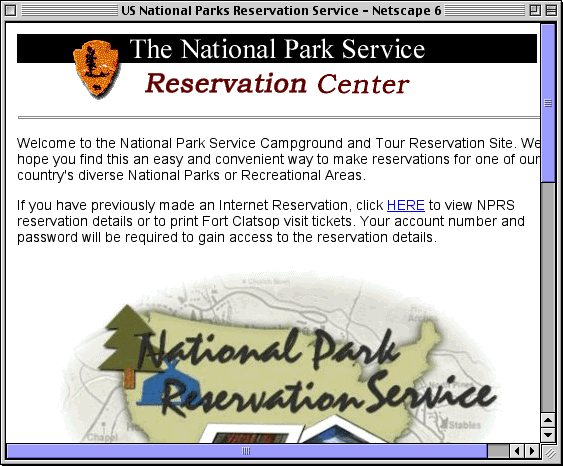
To make a reservation, visitors must first scroll down the page (see below).
Avoiding the Blooper
So many Web experts have complained about this design blooper before me that I'm not sure what more to say. What will convince Web designers, developers, and managers to make sure that the most important content is visible without scrolling.
Even just making sure important content is at least partially visible helps -- at least then users can see that there is something that they have to scroll down to see.
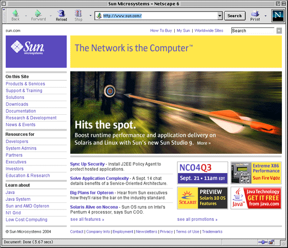
Sun Microsystems
Sun Microsystems' website is one site that does a good job of keeping important content in view above the fold. In fact, Sun's Home page requires no scrolling at all in "normal" sized browser windows (see below).