Web Blooper of the Month
Generic, Vague Error Messages
A common flaw in websites and web applications (not to mention desktop applications) is: error messages that are so generic and vague that they are useless.
America Online
For example, at America Online (AOL.com) a colleage encountered the error message shown below while attempting to register for a discussion group. The message is entirely devoid of useful information: it provides no clue what went wrong or what the user should do at this point. It's just a catch-all error message, apparently used to cover a wide variety of errors. (It turned out that the message was also false: the registration had succeeded.)

United.com
The AOL example is fairly extreme. A more subtle form of the blooper can be found at United.com, the website of United Airlines. The error message shown below appears when a user logs into a frequent-flier account, but types the account number without the leading zeros. The site says only that the number is "invalid" (see below).

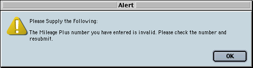
Faced with this error message, many users would assume they mistyped their number and retype it -- again without leading zeros. After a few repetitions of re-entering the number and getting the same error message, they might start to suspect that the leading zeros must be included.
Avoiding the Blooper
Error messages should describe the problem and suggest a solution. They should do both of these in terms understandable and meaningful to their intended users.
Generic error messages that cover a wide variety of errors may save development time, but they waste a lot of customer/visitor time. They don't support users in accomplishing their intended tasks -- in fact they hinder the completion of tasks.
Web development teams should write specific error messages for each error case. If a single dialog box is reused for all the messages, it needs to be parameterized so it can display specific messages.