Web Blooper of the Month
Fixed-Width Layout
One blooper that a large number of websites commit is using a fixed-width page layout, rather than letting the width of the content be determined by that of the visitors' browser windows. Fixed-width page-layout is bad for three reasons:
- content is cut off when the browser window is too narrow, requiring users to scroll horizontally to see it all,
- space is wasted when the browser window is too wide, because the content does not fill the space,
- text formatting can be screwed up if the user increases the browser's text font size.
Unfortunately, this blooper seems to be becoming more common, perhaps due to a proliferation of web-design tools that create fixed-width pages by default.
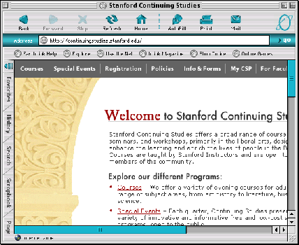
Stanford University Continuing Studies Website
One site that commits this blooper is that of Stanford University's Continuing Studies program. If your browser window isn't wide enough, the text is cut off on the right.
CHI 2004 Conference Website
The fixed-width blooper can also be found at the website of the CHI2004 conference. Pages on this site consist mainly of two columns: a navigation column and a content column. Because the content column has a fixed width, if a visitor's browser window isn't fairly wide, important content will be cut off on the right side.
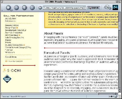
The page layout on this site is not very complicated, so its fixed-width format is hard to understand. It is especially surprising to find the blooper at the CHI 2004 site, since CHI stands for Computer-Human Interaction, and the conference is all about making computer-based systems to be easier to use.
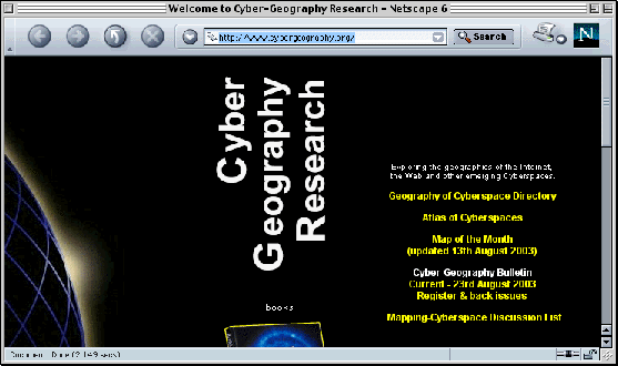
CyberGeog.org
The website CyberGeog.org (of the Cyber-Geography society) used to have a pretty bad case of fixed-width layout.
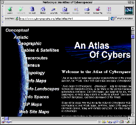
OK, perhaps the navigation "column" on the left needs to have a fixed width. But the main content of the page is just a block of body-text. There is no excuse for it not reformatting to fit within the users browser window.
Avoiding the Blooper
Fixed-width page layout reflects a lack of understanding of the nature of the Web. The Web is not a magazine. Unlike print media, the Web makes it possible, or at least should make it possible, for Web users to control their own viewing experience. Web designers should not seek to control every aspect of site-visitors' experience. Page width, along with typeface size, is an issue that should be left as much as possible to be controlled by site-visitors, through their browsers.
Fixed-width layout is almost inexcusable. A small minority of sites may need it, e.g., online art galleries, slide presentations, or news sites that imitate the look of a printed newspaper. Data-entry forms in e-commerce sites and web-based applications may also require fixed-width layout. But most web pages present a collection of navigation controls, some images, and some text. For such pages, fixed-width layout is inexcusable.
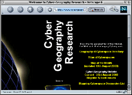
Recently, CyberGeog.org improved their site, among other things changing the page-layout to be variable-width (see below). Well done!