Web Blooper of the Month
Tiny Fonts
StanfordBookstore.com
Below is a paragraph from the home page of StanfordBookstore.com, the website of Stanford University's campus bookstore. The image has not been rescaled or reduced in any way from what was displayed in my browsers (Netscape Navigator 4.76 and Internet Explorer 5.0).
The obvious problem with tiny text is that many people can't read it. As people age, the limit increases. Most people over the age of 45 can be considered "visually impaired" for reading small-print text. Much of the text in many websites is illegible for a large proportion of the population. This is certainly true of the Stanford Bookstore website, which is probably used more by older people taking continuing education classes than by Stanford's college-age students, who mostly use the brick-and-mortar store on campus. Text that can't be read might as well not be there.
Most Web browsers include controls for changing the font-size of text. In theory, this lets people choose larger fonts if they can't read text in the default size. In fact, most Web users have no idea how to adjust the fonts in their browser. Even knowing how to adjust the browser's font settings may not help, because many websites render the browser's controls impotent by either: a) explicitly setting font sizes, or b) embedding text in images. For example, the font settings have no effect on Stanfordbookstore.com (or any of the sites shown in this article).
FractalCow.com
Next, we have the home page of FractalCow.com, an online web "zine". Again, the page-image has not been rescaled or reduced from what was displayed in my browser (Netscape Navigator 4.76).
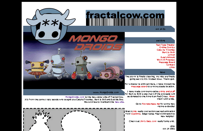
This example shows that aging eyes aren't the only limit. The text at FractalCow.com is so small no one could read it. The small font is especially inexplicable given all the empty black space on both sides of the page's fixed-width content area. (Note: the text appears slightly larger in Internet Explorer.)
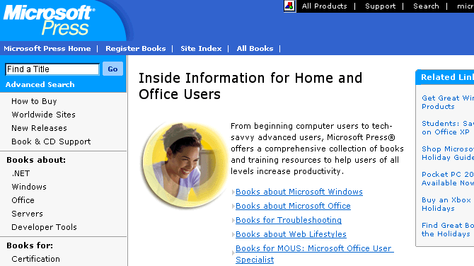
Microsoft.com
Browser incompatibilities exacerbate the problem. Text fonts that are legible when viewed in one browser may be too small when viewed in another. Netscape Navigator tends to display text smaller than does Microsoft Internet Explorer. Unfortunately, many web-developers test their site using only their own favorite browser. Thus, they fail to notice that some or all of the text on their site can't be read in other browsers that visitors to the site are likely to use.
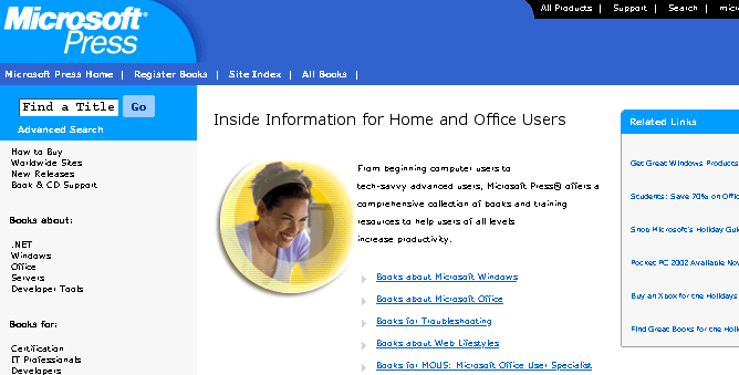
Microsoft's website has tiny text fonts when viewed using Netscape Navigator. Above is only one of many such pages at Microsoft's site, viewed using Netscape Navigator 4.76. Of course, maybe Microsoft wants its site to be readable using only its own browser. The image below is the same page viewed through Microsoft Internet Explorer 5.0. Better, eh?