This is a new browser window. When finished viewing, just close this window.
User Interface Design Specification:
Digital Agent Corp:
Server Management Console
Release 1.0
Prepared for Digital Agent Corporation by UI Wizards, Inc.
Author: Jeff Johnson,
UI Wizards, Inc.
Creation Date: 21 April 2004
Last Updated: 3 July 2004
|
This document shows a typical user-interface specification. The yellow boxes are annotations (not included in actual UI specs) that explain the document's various sections. For your convenience, listed below are the annotated sections of this document.
Annotated Sections of this Report:
|
|
Here, we describe the purpose of this document: to specify the UI for a Web-based server management application. [Back to Top]
|
This document specifies a user interface design for the Digital
Agent Server Management Console, based on the previously prepared Management
Console Conceptual Model document and on design meetings with the Management
Console development team. This
design is also based, to the extent possible, on the Digital Agent Management
Solution document.
This document specifies designs for the major functional
areas of the Management Console:
the Home page, and the management pages for Service Groups, xImages,
Hardware, System Events, Users, and Console Settings.
The document begins with an overview of the Management
Console's major functional areas.
It next describes design concepts and guidelines that pervade the entire
the design. It then describes the
proposed user interface for each facility, listing open design issues for each.
|
The purpose of this section is to provide an overview of the functional components that comprise the application:. [Back to Top]
|
The Management Console consists of the following functional areas:
- Overview: Global System Overview (Home Page)
- Service Groups: Overview and management of Service Groups of web-servers, including upgrading software (xImages) running on Service Groups
- Execution Images: Overview and detail of xImages, and xImage construction
- Hardware: Status and configuration of hardware components, e.g., Web Packs, blades, filers, etc.
- System Events: Overview and detail on events -- both normal and abnormal -- generated and logged by the system.
- Console Administration: Management of user-accounts and global system settings.
|
This section describes over-arching conceptual design decisions embodied in the proposed design. At the end of this section, we list unresolved issues pertaining to the general design. [Back to Top]
|
This section describes over-arching conceptual design decisions embodied in the proposed design.
Overall Appearance and Layout
The Management Console is a web-application that runs in a web-browser. This design assumes that the browser used to run the Management Console is -- or has capabilities equivalent to -- recent releases of the two most popular web-browsers: Netscape Communicator and Microsoft Internet Explorer.
The general design framework for the Management Console is illustrated schematically in Figure 1 and in detail in Figure 2. Everything that the Console displays (except for dialog boxes) is contained in a web-browser's content area. For brevity, the browser's content area is referred to in this document as "the screen".
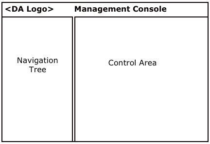
Figure 1: Management Console page layout schematic
At the top of the page, spanning the entire width, is a bar containing the Digital Agent Corp logo and the name of this product, e.g., "Management Console".
The left side of the page (about 1/4 of the width) is a Navigation Tree that lists the main content areas and all user-visible objects (e.g., Web Packs, servers, service groups).
The right side of the page (about 3/4 of the width) shows information and settings for the item currently selected in the Navigation Tree.
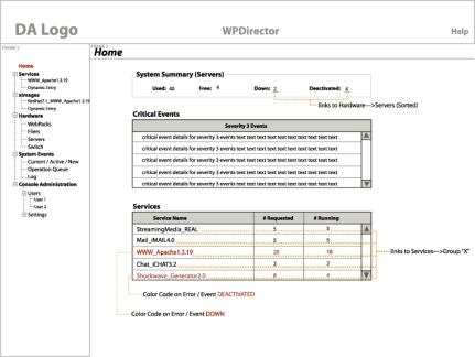
Figure 2: Navigation tree and Home page
Navigation Tree
The Navigation Tree looks and operates similar to the Windows File Explorer tree control (see Figure 3). It has the following characteristics:
- Selecting an item displays that item's data and settings in the Content/Control area of the page. Simply selecting a navigation category does not expand the category in the Navigation Tree.
- Categories in the tree can be expanded in two different ways: a) clicking on the + control
that marks the item as a category, and b) double-clicking on the category name. Expanding a category also selects it.
- It lists only objects and categories of objects, not actions.
- The Navigation Tree starts with the category-heading "Home". By default, this is the tree-item that
is selected when the console starts. The Navigation Tree contains category-headings for the major functional areas of the Console: Hardware Resources, Service Groups, Execution Images, Events, Console Administration.
- Under each heading, the Navigation Tree lists sub-categories or objects of the relevant type. E.g., under Service Groups, it lists all of the defined Service Groups; under Hardware Resources, it lists
the various sub-categories, e.g., Web Packs, Servers, Filers, Admin Console.
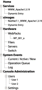
Figure 3: Navigation tree close up
- Most sub-categories list all of the resource-items they contain, e.g., Service Groups, Users, xImages. However, because of the potentially large number of Hardware components, the sub-categories in the Hardware category will not list all of the items they contain. Instead, the sub-categories in the Hardware category will show only the object-hierarchy down to currently-selected item (e.g., a server), displayed as follows:
+------Hardware
+------WebPacks
WebPack 37b
When the user changes the selection to another part of the hierarchy, the Hardware hierarchy-branch that had been displayed disappears from the Navigation Tree.
Content/Control Area
The Content/Control area on the right side of the browser window shows information for the currently selected in the Navigation Tree.
Content/Control Area: Navigation "Breadcrumb" Path
At the top of this area is a representation of the branch of the object-hierarchy that terminates in the currently-selected item in the Navigation Tree. The tree-branch is represented in the familiar "bread crumbs" fashion, e.g.:
Hardware > Web Packs > Web Pack 47
in which all but the last item (which represents the currently-displayed page) are links that users can click on to return to the corresponding page. The arrow (">") should be an actual arrow symbol if possible, rather than being constructed from minus and greater-than characters.
Content/Control Area: General
Long lists of user-defined objects are displayed in scrollable lists or tables so the entire Content/Control page is not lengthened. Controls at the bottom of the page (e.g., Apply, Reset) should not be pushed down off the bottom of the screen by long lists of items.
Tables of resource items (e.g., Service Groups, Servers, xImages) are used throughout the user interface of the Management Console. They appear in control panels for all types of resource items. For consistency of use, all tables all behave as follows:
- A displayed table has a fixed height and width, and scrolls vertically and (if necessary)
horizontally within that height.
- Table-cells that reference resource-items (e.g., Service Groups, xImages) contain links to the indicated resource-item. When clicked, these links change the Content/Control area to display the resource-item, with its Status tab-panel displayed. The corresponding object is highlighted in the Navigation Tree.
- Because clicking on an resource item in a list or table links to that object's page, list items and table-rows cannot be selected by simply clicking anywhere on the row/item. Item numbers at the beginning of each row provide (among other things) a place in each item/row that users can click to select (highlight) the entire item (row). [Note: If this UI for selecting rows does not work (either because of implementation difficulty or because usability testing shows that users do not understand how to select a row), the "extra" area will be augmented with a checkbox, and the column heading will be "Select".]
- When a table-row shows a resource that indicates serious trouble, not only does the row's Status indicate that there is a problem, the row is also displayed in red or some other distinctive color. The colors to be used are:
- Red: serious or critical problem, should not be ignored. [Note: use bright red.]
- Yellow: minor or potential problem, can be ignored temporarily.[Note: use
organish yellow so it can be read against a white background.]
- Black: situation normal.
Data-entry fields and other controls also look and behave consistently from one control panel to another. All follow these rules:
- Textual or numeric attributes that are never editable should be displayed as "text" objects on the panel, not as non-editable text fields. Or, if text and number fields are used to display such data, display of the fields' borders should be suppressed. This is to prevent users from perceiving non-editable fields as temporarily-inactive-but-sometimes-editable fields.
- Settings that are temporarily not editable (because they are not relevant given the current values of other settings) appear as disabled (grayed out).
- Fields for numeric settings should provide increment and decrement buttons. Eventually, some numeric settings should be presented as sliders.
Content/Control Area: Category Overviews
When a category (or subcategory) is selected in the Navigation Tree, the Content/Control area shows summary information for the category (e.g., status), and also a table of the resource items in the category, if any. Below the table are buttons for operating on the type of resource-item listed in the table. Operations provided by these buttons include: modifying, creating, copying (if applicable), and deleting items. The standard buttons for resource-item management tables are as follows:
- Modify: changes Content/Control area to display the detail page for the currently-selected item (table row), with that item's Properties tab-panel displayed.
- Create...: displays a dialog box for creating a new item. Users set the settings as
desired, then click the dialog box's OK button.
- Copy...: displays a dialog box for creating a new item using (mostly) the same settings as the currently-selected item. Users edit the settings as desired, then click the dialog box's OK
button.
- Delete...: checks whether the currently-selected item is in use (e.g., for Service Groups, whether the selected group is active). If not, the item is deleted. If the item is in use, an error dialog box appears telling the user that the item cannot be deleted right now because it is in use.
Other function-buttons may be provided below the table if relevant for the type of item in the table, e.g., Activate/Deactivate for Service Groups.
Content/Control Area: Individual Resource Items
When an individual resource-item is selected in the Navigation Tree (or linked to from a table displayed by the system), the Content/Control area shows status information and settings for the object. The information shown for a resource item is divided up into tabs. The first two tab-panels are standard for (most) item detail pages. The standard two tab-panels are:
- Status: Shows the current status of the item, but contains no editable settings.
- Properties: Shows the item's primary attributes, e.g., Name, Description. At the bottom of the Properties tab-panel (and perhaps other tab-panels that contain editable settings) are Apply and Reset buttons. These buttons behave as follows:
- Apply: When a user edits settings on the Properties panel, changed settings do not affect the system until the user clicks the Apply button. Clicking Apply updates any changed settings in the system.
- Reset: Clicking the Reset button restores all values in the tab-panel to the actual system values. After clicking Apply button, the system settings have been changed, so clicking Reset will only restore the last Applied settings.
Each type of resource item may have additional tab-panels that are specific to the type of item.
If settings on a resource item's Properties tab-panel (or any other tab-panels that has Apply and Reset) have not been saved when the user tries to switch to another tab-panel, the user is warned, and asked whether the changes are to be saved.
Dialog Boxes
If a function invoked from the Content/Control area requires additional parameters, it includes "..." at the end of its name-label, and it displays a "dialog box" to collect those parameters from the user. It does not simply display a new page in the same browser.
Most "dialog boxes" will be implemented as browser windows in kiosk mode (i.e., with the browser controls hidden). Certain special-purpose dialog boxes will simply use browser-supplied dialog-box forms (e.g., filechoosers).
However they are implemented, they include OK and Cancel buttons. Examples of functions that display dialog boxes are: "Create..." and "Copy...".
Dialog boxes should designed so that they do not pop-up additional dialog boxes. In other
words, we avoid having dialog boxes on dialog boxes, because multiple levels of dialog boxes can cause users to get lost or to lose the point of what they were doing. There are a few exceptions: common dialog boxes having very familiar functions (e.g., file-choosers, date-pickers) can be displayed by dialog boxes.
Reports
The Management Console provides facilities for creating printable reports on any aspect of the WebPack system. The idea is simple: the system can create a report for any Content page in the system (e.g., Home, Service Group Overview, xImage Detail, Filers Overview, Events Log). Reports are generated as HTML documents, then displayed in a browser, allowing users to either print or save them, as desired.
Users create a report by going to the page corresponding to the desired information and clicking on a "Print Report..." button. The button is positioned so that it is clear that it applies only to the Content/Control area of the screen, i.e., not to the Navigation Tree. One good place for this button is on the right side of the area enclosing the Navigation "Breadcrumb" Path. An alternative is to add a general purpose command toolbar to the top of the Content/Control side of the display, above the "breadcrumb" path, and put the "Print Report..." button there (in addition to other buttons that may be needed). The button should be labeled with an icon suggesting a printed report (e.g., a sheet of paper with lines on it). It should also have a textual tooltip: "Print Report...".
Clicking on the Print Report button displays a "dialog box" (kiosked browser) offering a radiobutton choice of the form of report to print, with "Regular" as the default (see figure 3.5).
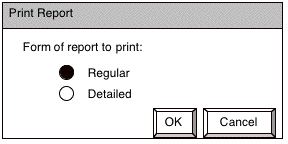
Figure 3.5: Print Report dialog box
Choosing "Regular Report" (the default setting) prints more-or-less the same information shown on the screen, but with resource-items listed in plain HTML lists rather than in scrollable tables. Choosing "Detailed Report" prints significantly more detail in each section and on each item in the resource
list(s). Different sections of the report are separated by horizontal rules, and have headers identifying the section.
The OK button closes the "dialog box", generates the report, and displays it in a regular (non-kiosked) browser (but separate from Console UI's browser). Note: While the report is being generated, the screen pointer should be a wait-cursor. If generating a report takes longer than a few seconds, a progress bar should be displayed in the report browser window.
The Cancel button simply closes the "dialog box" and cancels the Print Report operation.
Once the report is displayed in its own browser window (neither the kiosked browser of the "dialog box" nor the Management Console's browser), a user can use browser's controls to Print the report or Save it in a specified file (as HTML).
Resolved General Issues
- Do we need a functional area for managing Packages? Resolution: Yes.
- If our UI for selecting a row in a table may not work, either because of implementation difficulty or because usability testing shows that users do not understand how to select a row. In that case, what to do? Resolution: the item number column heading could be labeled "Select". If necessary, we could add a checkbox for selecting columns, as many web-applications do. However, this is considered a sub-optimal solution.
Unresolved General Issues
- The Hardware categories in the Navigation Tree behave differently from other categories in that they don't list all their resource-items. Whether this inconsistency causes too much difficulty for users will have to be determined by usability testing.
- Would it perhaps make sense to add a command toolbar above the Navigation "Breadcrumb" path, for commands that apply to the Content/Control area of the display but, unlike the command buttons below resource tables, aren't specific to resource-items. E.g., the above-described "Print Report..." button.
|
The bulk of a specification consists of detailed specifications for the design of each functional component of the Messaging application. [Note: In this sample specification, only a sampling of the component specifications are included -- enough to show what is included in each component's section.] It also contains unresolved (open) design issues. [Back to Top]
|
Home Page

Figure 4: Home page
Description of Home Page
The Home page is a high-level overview of the status of the entire system. It is the top-level window onto the current functioning of all the Web Packs and supporting hardware.
At present, we plan to display the following information on the Home page:
- "Bread Crumb" navigation aid at top of page: Home (not a link).
- System (Hardware) Summary: number of servers in use, number free, number down, number intentionally switched off.
- A list of recent critical events from the Log.
- A list of currently-active Service Groups and their status.
Resolved Issues for Home Page
- If we get to the point where there is more information to show here than will fit on one page, we can break it up two different ways: a) tab-panels, or b) sub-pages in the Navigation Tree. Resolution: If necessary, divide up the Home page data by adding sub-pages of Home to the Navigation Tree.
Unresolved Issues for Home Page
- It isn't yet clear what information would provide system administrators with the an adequate overview of the system. It also isn't yet clear what summary information will be available to show users. In the long-term, Digital Agent should allow users to customize (personalize) the Home page, i.e., to choose what summary information is shown there. Medium-term, one way to provide limited customizability is to provide checkboxes (either right next to the info itself or on a separate page in Console Settings) for displaying or hiding each of several different sections of information. In the short-term, Digital Agent should try to determine what summary information will satisfy most users.
- In the long term, the data on this page should be displayed graphically; not just textually, numerically, and tabularly.
- The "System Summary (Servers)" label seems too vague. The parenthesized name suggests that we couldn't decide on a single good label. Suggested replacement labels: "Hardware Summary", "Server Summary", "Server Overview".
Service Groups Overview Page
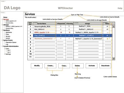
Figure 5: Service Groups Overview page
Description of Service Groups Overview Page
The Service Groups Overview page lists all the Service Groups, shows their status, and provides a way to drill down to look in more detail at a specific Service Group. It also provides controls for modifying, creating, copying, deleting, activating, and deactivating Service Groups. The elements of the page are as follows:
- "Bread Crumb" navigation aid at top of page: Service Groups (not a link).
- Table of all Service Groups, with columns for: selection, Name, # of Servers Requested, # of Servers Running, base xImage, and Status.
- Buttons for managing Service Groups:
- Modify: changes Content/Control area to display the currently-selected Service Group (table row), with that Service Group's Properties tab-panel displayed.
- Create...: displays a dialog box for creating a new Service Group (see Figure 6). Users set the settings as desired, then click the dialog box's OK button.
- Copy...: displays a dialog box for creating a new Service Group using (mostly) the same settings as the currently-selected Service Group (see Figure 7). The Name field contains the Name of the
copied Service Group, but with "(Copy N)" appended (where N is an integer ≥ 1). Users edit the settings as desired, then click the dialog box's OK button.
- Delete...: checks whether the currently-selected Service Group is active. If it is inactive, the Service Group is deleted, and it disappears from the table. If the Service Group is active, clicking Delete displays an error dialog box saying "Sorry: the Service Group <name> is active. Active Service Groups cannot be deleted. Please either deactivate this Service Group and try again, or select a different Service Group to delete."
- Activate: activates the currently-selected Service Group. The Service Group's new active status is shown in the table of Service Groups.
- Deactivate...: deactivates the currently-selected Service Group.
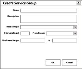
Figure 6: Create Service Group dialog box
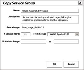
Figure 7: Copy Service Group dialog box
Resolved Issues for Service Groups Overview Page
- When a new Service Group is created (not copied) should its Name default to blank, or should the system assign it a default name? Resolution: Assign a default name: "New Service N", where N is a number.
- When a new Service Group is created (not copied) what should its Number of Servers default to? Zero? One? Other? Resolution: The default # of servers for a new Service Group should be zero.
Unresolved Issues for Service Groups Overview Page
- It is yet unclear what the possible status states for a Service Group are, or how they should be illustrated.
- Eventually, buttons that are not applicable to the currently-selected Service Group (e.g., Delete, because the S.G. is active) should be inactive (grayed out) rather than displaying an error message when the user clicks them. However, this is difficult to implement in Web-based applications.
- On the Add and Copy dialog boxes, the controls for choosing a Service Group may eventually have to allow for the fact that Service Groups will be categorized into Service Group categories. This could be accomplished by: a) allowing the menu to list the categories (but not allow one to be selected), or b) providing a separate menu of Service Group categories than, when set, determines which Service Groups are listed in the Service Group menu.
Service Groups Detail Page
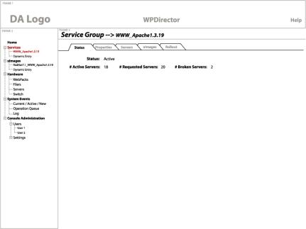
Figure 8: Service Groups Detail page
Description of Service Groups Detail Page
The Service Groups Detail page shows the detailed information and settings for a particular Service Group. It contains the following elements:
- "Bread Crumb" navigation aid at top of page: Service Groups > <SG name>, where the word "Service Groups" is a link to the Service Group overview page, but the Service Group name is not a link.
- A set of tabbed panels, labeled: Status, Properties, Servers, xImages, Rollout. See subsections below for the content of each tab-panel.
Status Tab-Panel
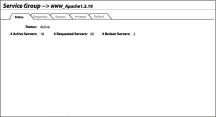
Figure 9: Service Groups Detail: Status Tab panel
Properties Tab-Panel
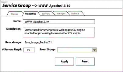
Figure 10: Service Groups Detail: Properties Tab panel
Servers Tab-Panel
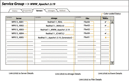
Figure 11: Service Groups Detail: Servers Tab panel
xImages Tab-Panel
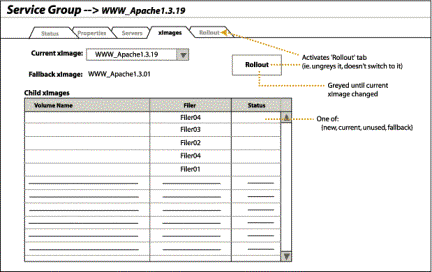
Figure 12: Service Groups Detail: xImages Tab panel
Rollout Tab-Panel
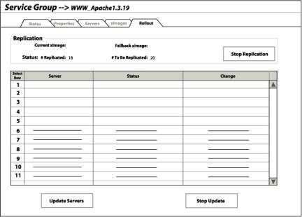
Figure 13: Service Groups Detail: Rollout Tab panel>
The current design, rolling a new xImage out to a Service Group's allocated servers consists of two major phases: a) making child-copies of the new base xImage for all the servers, and b) rebooting all the servers with their child-copies of the xImage.
The copying phase will probably take significant time, e.g., 10-15 minutes. It will be important to indicate the progress of the copying process.
The rebooting phase supports only manual rollout of a new xImage to a Service Group's allocated servers, i.e., the user selects one or more servers in the table to update, then clicks on an Update button to start the process (with an option to abort in mid-operation).
Resolved Issues for Service Groups Detail Page
- None
Unresolved Issues for Service Groups Detail Page
- On the Status tab-panel, for info that isn't shown in a table, how will users drill down to get more info?
- The goal of the Servers tab-panel is to show what servers are in this Service Group, what xImages they are each running, and where (i.e., on what Filer) the xImages are stored. In the long-run, this info might be better shown graphically/iconicly rather than in tables.
- The xImages panel may need to show rollout status, even though the controls for Rollout are on the Rollout tab-panel. The question is: how to show the rollout status compactly?
- On the Rollout tab-panel: The copy stage will probably take significant time, e.g., 10-15 minutes. It will be important to indicate the progress of the copying process. The question is: how? Tentative resolution: Show on Service Group's Status and on Rollout tab panels.
- Users will eventually want more automatic ways to rollout new xImages to servers. Rollout option to consider for the future: progressive: update N servers at a time at a given time-interval.
- The Rollout tab-panel may need a Select all button and/or an Invert Selection button (which selects all Servers that aren't selected and deselects those that are).
Hardware Overview Page
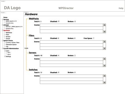
Figure 22: Hardware Overview page
Description of Hardware Overview Page
The Hardware Overview page shows important status information about the Hardware components of the system. It contains the following elements:
- "Bread Crumb" navigation aid at top of page: Hardware (not a link).
- Summary information about the status of the Hardware components of the system: Web Packs, Filers, Servers.
- Table of events pertaining to Web Packs
- Table of events pertaining to Filers
- Table of events pertaining to Servers
Unresolved Issues for Hardware Overview Page
- What is on this page?